Showing posts with label DD1101 - Creative Thinking. Show all posts

Mixing Styles Part 3

This week a lot of progress has been made in imitating the Styles of Ashley Wood and Marek Okon. These concepts I'm drawing in these styles should be finished by next week.

Here they are:
This is in the style of Marek Okon. It has a lot work that needs to be done to make it look photorealistic like this style. It's unlikely it will look photosrealistic when finished, but I'll work on it.

This is my approach to Ashley Wood's style of painting. I didn't use any lines, which shows why it is so rough. The background colours were taken from the general colour scheme Wood tends to use. There is a giant mushroom in the background,  not sure why. Might make it a theme. This picture should be finished soon.

Edit:
The finished images look largely the same. It was interesting to try and imitate another persons style of drawing. The assignemnt wasn't really seeing how well we copy the style, but how well we can cope trying to draw in a different way to we regularily do. I liked drawing in Sean Galloway's style as it is a cartoony style and I am much more interested in this art style. Marek Okon's style of drawing wasn't really that interesting, it was just trying to imitate real life. It seems to lack a little creativity, leaving aside the actual characters within the drawings, just trying to make images look realistic seems a little boring. As for Ashley Wood's style of painting, I found this quite interesting. I decided to not use any lines within my painting and used a similar pallet. It was good as it was so different than what I'm used to drawing.

Mixing Styles Part 2

This week I've mostly finished the work in the style of Sean Galloway. Just needs a bit of finishing. For the next piece of art based on Ashley Wood I've started, but there is still a lot of work to do.

Here is the piece baced on Sean Galloway:

 
Here is the Ashley Wood Piece so far, It has a lot of work left to do:
 I'll post more progress next week.
 

Mixing Styles

For this assignment I must create three drawings in 3 different styles fro m3 different artists. These artists are Sean Galloway, Ashley Wood and Marek Okon. These artists have very different draing styles.

Sean Galloway is more of a cartoon artist, specialising in squarish fingers, cell shading and bright colours. I like Galloways work as it suits the style of art I like to draw, Being more of a fan of cartoons than realism.

The second artist, Ashley Wood is the most interesting looking as it is all done in oil paints. Big clear strokes of the brush can be seen and few colours are used, dark ones at that to emphasize Ashley's theme of World War 2 times and robots.

The final artist I need to imitate, Marek Okon, specialises in photorealistic art. Honestly I'm not looking forward to drawing my character in his style as I tend to avoid realism as it requires a lot of detail. This is something I don't really add to pictures.

My character has no name but so far is a Bee Girl. I've started doing the design work in Galloway's style as this is what I feel I'd be comfortable doing and have had the most fun doing.

Here is the picture so far:


As can be seen, it's a cartoony character. I'll work it more into Galloways style then I'll start to recreate it in both Ashley Wood and Marek Okon's styles.

I'll report the progress on this next week.

Designing an Environment part 2

Good progress has been made on the village sketch. I'm currently adding shade and detail. Not much else to say other than today colour was added, as well as new buildings and features to the village.

Here is a what it looks like so far:
As can be seen, the main problem is a  lack of detail. This will be priority for now. The finished product will be uploaded on the next blogpost for creative thinking on either thursday or friday next week.

Edit:
Here is the final image:
I've added more detail such as lights an made the scene look like it is at night. Overall, I enjoyed this assignment as I prefer designing environments to characters, as I amn an aspiring level designer.

Designing Environments

For this assignment the class must design an environment based on a building in Manchester city centre. I chose a small pub for the basis of a small village in the hills.

First I made a simple 3D model of the scene in 3DS Max to help with perspective, which is an important anspect of this assignment.

Here is the progress made so far. The colours have been created from the 3D models and I am using it as a guide to draw. The scene will be wintery, but with no snow, just colder colours being used (such as blues and bluey greens and greys). I've not followed the model exactly but that doesn't matter for now.

I'll have to add more detail aswell, there might be a forrest or something in the background, faded with the mountains.

Designing a vehicle part 2

This week for the vehicle design I've finished the main bulk of the drawing and colouring. I'm not going to work on the shading to give it a more 3d look. The driver is a rabbit, being an old friend of the owner of the limo, Winston (from the Heros and Villains assignmnet).

The limo is dark grey/black with orange highlights and has many comfort features expected in such an expensive vehicle.

The rabbit drives Winston around and also has access to the limo's features. There is no front door for him to get into the limo, so he must enter by a sliding door on the side of the limo.

The estimated selling price is said to be above £1,000,000.
Edit:

Here is the finished car. I added lighting and fixed the shade so it wasn't too dark. Unfortunately, the print is a lot darker. I enjoyed this as I've alsways had an interest in vehicles and getting to design my own was fun. Originally I was going to draw a Train Chainsaw (Basically a Train with a giant saw on the front) but then I though that it would be too complicated. I might try and sketch one up at some point though.

Here is the driver:

He is a rabbit because the vehicle fits into my animal based universe from the heroes and villains assignment. He's quite old but he is a skilled driver. It seems that he a little annoyed about something. I dodn't really like drawing him as I'm not too much of a fan of drawing characters. A lot of my characters seem to wear suits. I tried modelling this in 3D first just to get the perspective right. I'm likely going to use 3D for perspective in a lot of work.

Vehicle Design

For this assignment we've been tasked with designing and drawing a vehicle with it's driver. My idea follows with the theme created by the Heroes and Villains assignment. It will serve as the limo of the main antagonist, Winston Kingston IV.

It's front grill is based of cars from the 1930's while windows are triangular and the rest of the car is based off of modern to futuristic design. The limo also has expandable wings and jet engines which take in air from various slots on the sides of the body and through the grill.

Details of what's inside will be revealed later, along with who will be lucke enough to drive it. Did I also mention that it has armour?

Designing Weapons Progress

A week before the weapons and armour sheet needs to be handed in, I'll go into the final designs. The Armour will actually be 'Power Ranger' style, with skin tight clothing with a motorbiker style helmet. Armour will be placed over this thin cover, but being set in the future, the armour itself can withstand light fire.

The heavy weapon is now a bazooka which folds into a jetpack (double functions) and can be straped to the users back.

The Robo Cat is a concealed weapon and is smaller than before but is released in secret and attacks the enemy without them noticing with frighteneing sharp speed and claws.

The pistol has been recoloured to the same colour as the Robo Cat. It is more of a functional tool than a weapon. The colour that is chosen by the slider on the barrel determines the effect. For example, selecting yellow will allow the gun to shoot beams of light, to light up any dark areas. This gun can also be used as a weapon in a desperate situation.

The overall theme of this set is the ability to fold away and being electical based. The Robo Cat uses electricity to function, the assault rifle launches arcs of electricity at foes, the pistol uses electricity for most of it's functions and the bazooka doesn't fire grenades or shells but overcharged bolts of electricity which cause a shockwave which electrocutes a reasonable area where it hits.

Edit:
Here are the final images of weapons and armour:

 
Here are the finished weapons. I liked designing weapons and I tried to be creative with them. Aproblem is a lot of the time it is too easy to design something based on something else and leave it at that. I tried to design my weapins based on exisitng technology but tried to add something new. For example, the assualt rifle and the pistol look very similar to normal gun design, but extra futuristic features have been added such as electromagnets and weird colour effects. I think that I should have put more detail on the assault rifle though. MAybe smoothed the lines some more.

I'll be honest, as drawing an actual character wasn't important and the main idea was armour design, I decided to use a pose for the armour. This is quite obvious as the character in the armour seems to be drawn to a much higher quality than I usually draw. I led drawing this though as I didn't have to really worry about proportions. I went for a power rangers style theme of coloureful, skintight armour. I've also pointed out where all of the weapons go within the armour.

Weapons

This week we moved away from drawing characters to drawing weapons. For this assignment it is required that a set of weapons and armour are drawn. A heavy weapon (like a bazooka), a standard weapon (like an assault rifle), a light weapon (like a pistol) and a concealed weapon (like a hidden blade) must all be drawn.

My design idea is cat based, to fit in with the universe created in the Heroes and Villains assignment. The helmet has cat ears to enhance hearing and has a universal translator (Cat to human/ cat to cat).

The heavy weapon is actually a robot the user can release, which will help the user in combat, but only for a short amount of time. The robot is charged by solar panels on the backpack it is stored in.

The standard weapon uses electro-magnets to direct high voltage current toward a targeted enemy. The barrel of the gun doesn't actually release the voltage from the inside, that is used to launch tiny metal claws which grip onto the target. Then, the metal claws can be used to direct the lightning beam where to strike from the gun.

For a concealed weapon, I was thinking of a cat claw grenade. The grenade is covered in spikes which stick to an object when thrown. Then after a short amount of time the grenade explodes, showering the area in very sharp claws.

I'll have more information by next week, I'll also have a better idea for the functionality of the robot and the light weapon.

Sea of Ghosts: Maskelyne redesign

Progress on the Maskelyne redesign is going well. I'm trying to make him look thin with a tired aggressive look to make him look villainous. He has pale skin as I feel being rich and a unmer researcher he spends a lot of time inside doing research.

He wears fancy clothes as he is rich which are bright in colour. They are dark red and peachy coloured. He has long, boney arms and is holding a unmer artifact. I have yet to draw this, but due to the way I decided to shade, it looks like the light comes from the artifact. The art should be finished next friday. I'll post an image of it then. The picture will contain a front view a nd back view of Maskelyne, both at a 3/4 angle view.

Here is the finished work:


I'm glad I got to draw Maskelyne as I feel he is ine of the most interesting characters from a Sea of Ghosts. He can be funny but also has a cruel side. But he sees the logic in everything, even his own bad actions. This makes for an interesting character.

Anyway, I still have the same problem of drawing characters but I think there has been a slight improvement. I still need to work on arms and legs and try to make them look more realisitc (in terms of proportions.

Sea of Ghosts: Maskelyne


Maskelyne is a character from the novel titled "Sea of Ghosts" by Alan Campbell. The novel is set in the mid 1400's (15th century). Races of creatures which seem to use sorcery called the Unmer have spent the last few centuries at war with it, humans and psychics. Eventually they became imprisoned by the psychics who allowed humans to take over much of the world. The free Unmer then released millions of little bottles into the sea called 'sea bottles' which release toxic brine when opened from a seemingly infinite supply. Because of this, the world is slowly flooding with a dangerous sea which burns anyone who touches it, badly disfiguring them.

There is another race of people in this alternate universe, they are the drowned. As you can expect these are people who have drowned in the brine, but through a large chance they come back to life, to live under the brine disfigured, looking up out of the surface of the water to see the world they once lived. Research conducted seems to indicate that the drowned seemingly lose the essence of who they are over time, after a while to only repeat actions they had done before their mind had gone, unsure what they are actually doing or its purpose.

Moving on to Maskelyne; a character which is mentioned quite early in the book is seen as an antagonist. He has a real malicious and cruel side to him, which contrasts with his caring nature toward his son and (in his own opinion) his wife. He is one of the antagonists to Granger, the protagonist of the novel. Maskelyne took Granger's daughter Ianthe to hunt treasure, killed her mother by drowning and took advantage of Ianthe's unnatural skill to see and hear through other people.

He has an obsession with Unmer artifacts. He researches them with great interest, trying to understand how they work. He philosophizes possible ways they could work and in parts of the novel has mentioned scientific theories that are seen to be true in real life such as particles traveling all possible paths at once. This has left him with various weaponry and gadgets which are difficult to use, but are much more powerful than what any human could create. His favorite weapon is a gun which has a human skull around the barrel, which fires a creatures called void flies. These flies basically destroy matter they come into contact with so this is a very dangerous weapon. One hit sunk a full Emperor sized yacht.

Maskelyne has quite a lot of money, likely from the treasure hunting business he runs. When we first meet him in the novel he is introduced to Granger as a prisoner as a plan to trap Granger to get access to Ianthe and her mystical powers. His 'cell' has high ceilings and various things to help him in his interests. This was one component which helped Granger discover that he was Maskelyne which allowed him an attempt to escape. Unfortunately Maskelyne's men caught him later and imprisoned him.

I feel that Maskelyne is roughly middle-aged based on the fact he has a 2 year old son, but also has a lot of experience of the world and even seems to sometimes show his cynical side. Due to having wealth, he is likely well groomed.


Assignment 5: Working in 3D

To understand lighting and seeing our art in a more 3D way instead of 2D on photoshop.
Using Fimo clay I modelled a futuristic walker. I didn't paint it as I never came up with a good paint scheme for it. The surfaces aren't very smooth but I like how it turned out. Given the chance I would like to smooth the sides and add more detail. Possibly painting it too when I can think of a good colour scheme. As I made the model more ideas came to mind so it ended up being a futuristic mech walker with a tophat and a tail reminicent of Mewtwo from pokemon. It does lack detail, maybe in future I could practice some more and create a more detailed version, or even in 3DS Max.

Assignment 6: Heroes and Villains

Just before Christmas  good and evil battle again! In class we were told about how heroes often use less sharp edges, colours like blue and white and will not look aggressive. Villains are shown in darker colours such as red or black and tend to look very aggressive and dangerous to all who encounter them.

We were also shown that the definite difference between good and evil does not exist and you could have a bad protagonist or even an antagonist with good intentions but going about them the wrong way.
That is where Nefarious and Winston Kingston IV come in. Nefarious doesn't sound like a very friendly or heroic name but it was the name of the scientific project that created him. Winston Kingston IV is just a businessman who found a way to make a lot of money, he is doing what he believes is best and wants to help humans who can not grow fur n cold winters like this.

Here are their character profiles:


Assignment 4: Shape and Silhouette

Ever noticed how the shape of a character will tell you everything you need to know before you learn anything about them?
Using shape and silhouette can help define a character before it is even designed!
There are 3 main shapes that characters fall under. Circles, squares and triangles. Circles are more friendly, squares are shown to have more authority and protect others while triangles are known to be more aggressive.
Silhouettes are used to design a character without having a definite idea. You just erase parts of the silhouette and add detail.
For my art I drew an ape based on a circle and someone insane based on a square.
I tried to break the mold by having the shapes mean different to as expected as the ape is in a threatening pose, as if chasing the audience. The insane man also is lacks authority but is based a square. Both of these characters could actually have backstories which fits the shape they are.
Is the ape usually calm and friendly and was just pushed over the edge? Was the insane man once a member of the police force? It's good to look into character backstories for this reason, it makes the character itself much more interesting.

Here are the images:


Assignment 3: Colour and Light

The main aim of this assignment was to discover how to accurately colour an object with shading from lighting.
I mentioned earlier that I drew a man with pale hair and what looks like a Sainsburys uniform. I made it look like this as before we drew our own we were recommended to practice colour and shading on a ready drawn image. The bright orange tie contrasted a lot and stood out in that piece and also did in this image where most other colours were washed out.
The shading is a little too sharp. I tried to get a smoother transition by using more shades between light and dark but I notice I'd need even more in future.


Assignment 2: Photoshop

This assignment was used to help the class get used to using Photoshop and a tablet. I don't really like this picture but I'm going to keep it here to document how much I may improve over my time in the creative thinking class. I might just redo this piece, the left arm is out of place and the background isn't needed. I did like the 3/4 view of the character though, really the left arm lets the image down. Really it shouldn't be clearly visible. I might just modify the arm and put stronger lines on the feet to make them morte viisable in photoshop.


Assignment 1: Myself as a character

As mentioned, for this task the class had to produce a drawn image ofourselves as a character from a video game series of our choice.
The game series I chose was Sonic the Hedgehog by Sega. The reason for this is that I'm a big fan of that series.

Before picking Sonic I thought of a few other series. One was Grand Theft Auto by Rockstar games. I soon realised that drawing myself as a character from Grand Theft Auto would not be very different from a normal drawing of me as the series imitates and satires real life.
Another series was Pokemon, made by Game Freak. I didn't choose this series as I felt that to make it look like pokemon, an actual pokemon would have to be drawn. I didn't think I could draw a pokemon that well being so early in the course.

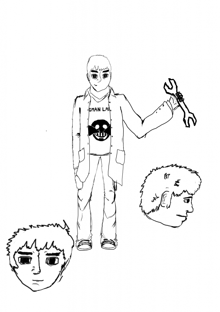
For the image I drew myself as an employee to Dr Eggman, the main villain to the Sonic series. I couldn't draw myself as good as all of the good characters are usually animals. I had a lab coat, a spanner to mend robots and a shirt that says "Eggman Land" on it.
There are two versions of the image, one draen on paper, one drawn in photoshop. The one drawn in photoshop is cleaner but the one on paper has more details linked to the Sonic the Hedgehog franchise.

Here Is the new image. The main difference being that the second one iscleaner as it was done on photoshop. I'll upload the older image later when it's available for comparison.


Creative thinking overview

It's time to talk about my portfolio. I'm typing this on a phone so I don't have the pictures available at the moment.

I'll go through the assignments in order with a brief description of each. There will be a blog post for each later with the images included.

Assignment 1: Myself as a character - For this assignment it was asked that I drew an image of myself as part of a video game series. It was to test my ability to draw humans in proportion.

Assignment 2: Photoshop Test - As few people in the class had used photoshop or a tablet before, this was used as a practice of proportion (like assignment 1) in photoshop.

Assignment 3: Colour and Light - This was where we learned about colour and shading, depending on the location of the light source. I drew the head and sholders of a man. He had grey hair and a white shirt with an orange tie. I'll go into more detail in that blog post.

Assignment 4: Shape and Silhouette - Here we learned that the overall shape of a character can determine their character. We also added the idea that you could create a character easily from a silhouette by erasing away the detail.

Assignment 5: Working in 3D - Up to this point we had only worked on photoshop so had not really considered different angles and such when designing our work. So, we were tasked with creating a model using fimo clay, wire and tinfoil.

Assignment 6: Heroes and Villains - I've already posted the partially complete villain but part of the assignment was to also create a hero and a backstory for both.

This Cat is Evil

Here is the villainous Cat For the Heroes and Villains assignment, found out that only one of the characters had to be coloured, but here is a concept of the main villain who has yet to receive a name. He also has no legs. I'll post a little more information on him when I post the hero, Mr Nefarious.


Not a lot going on here

I haven't written much on this section of the blog. I will post art when I have a starter portfolio prepared, which should be next week.
This year, there will be work to display based on myself as a game character (anatomy), using photoshop, colour and light, silouettes, sculpting and heroes and villains.
There should be posts of the work by next friday.